Sunday, November 9, 2014

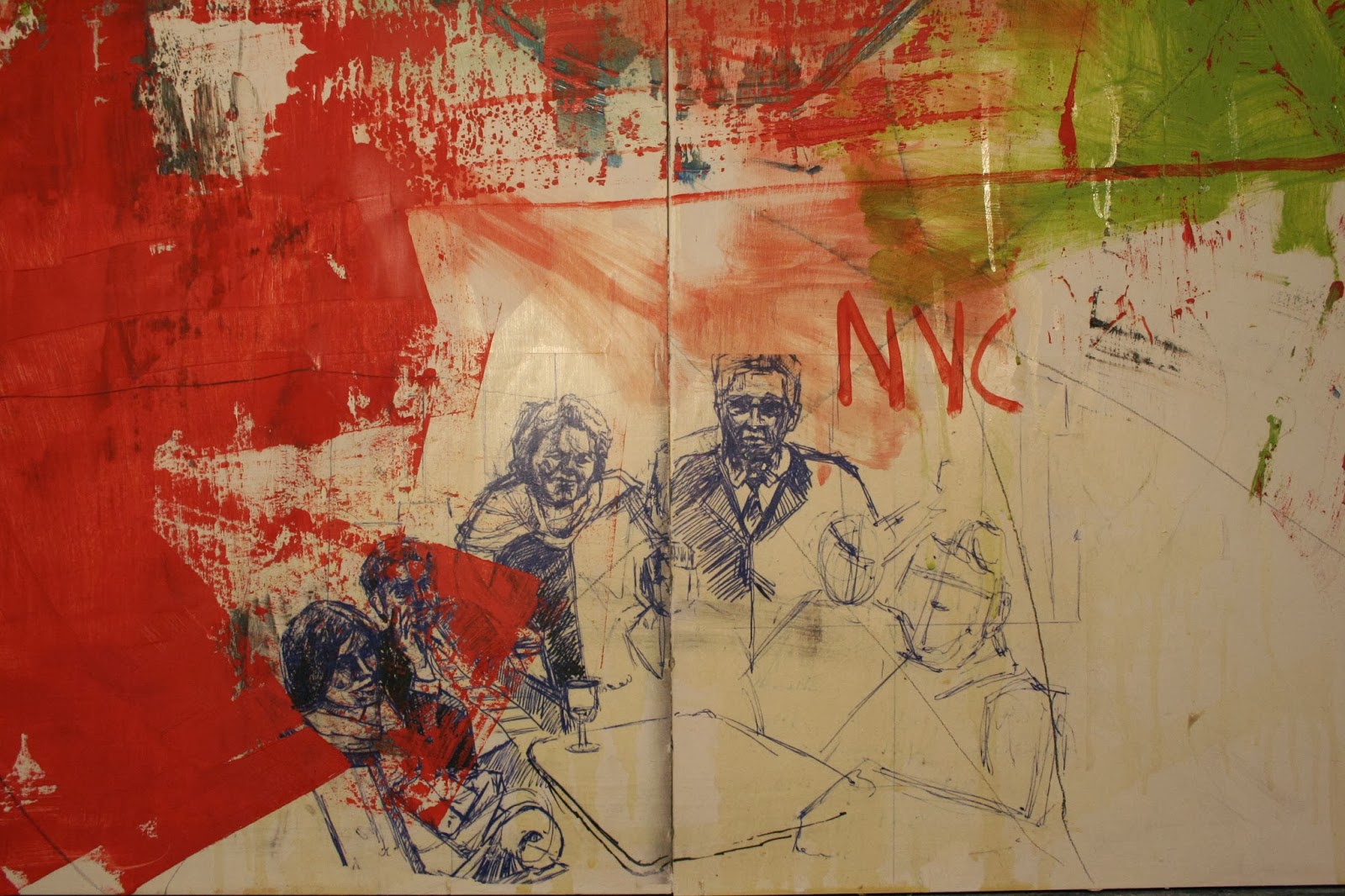
C and J, September 20th, 2014


C and J, September 20th, 2014
Print: 27x35.75", Paper: 30"x44"
Pulled three prints, not sure if if this is completely done or not. There are some areas that I could refine a bit, but for now I'll look it over for awhile and see if going back in to carve more is what should happen or not. 

Monday, November 3, 2014

Paintings Fall 2014


2 finished panels sitting in the studio. These are possibly going into the faculty show. 

Detail from the panel with the 5.

A third panel that is nearly complete, though it seems to be calling for a stenciled word. Something profound and meaningful . . . or just obnoxious. 


Sunday, October 26, 2014

C&J WIP

Work in progress, image of Caleb looking at Jacob shortly after the birth, final print is planned at 27"x36". 
Looking forward to printing this one.

Thursday, October 16, 2014

complient


The print is around 18x24 on a series of found maps. 
I also have an edition that is not on the maps. The ink is semi-transparent,
so the detail of the map shows through in an interesting way.

Wednesday, October 8, 2014

registration


This is a quick two color silkscreen, just to work on registration. 12x18


In order to demonstrate the two color reduction process I carved this little 9x12 in an evening and printed the lighter blue the following morning. I then carved the rest of the plate to get the darker blue to print the next day in class. Registration turned out alright. 11x17 paper

Sunday, October 5, 2014

Photo Table - Print Complete


Photo Table, Print 21.75"x23", Paper 29.77"x31.5"

On to the next print, I like how the block print compliments the panel paintings. 

Monday, September 29, 2014

Thursday, August 21, 2014

Boggs studio


Here's a shot from a couple days ago. Although it is not obvious here, I got the drywall mudded and painted this summer. I am still using the space where the bathroom will go as storage, but . . . it does feel good to have the walls and ceilings 'finished'

throw back


Came across this series in a box while I was cleaning out the basement storage area. These are were made as "weeklies" at the time that the studio was in the basement of the house. I can't believe I was spray-painting down there . . . so much. 


Friday, August 8, 2014

Jesus Panel


30 x 48 inch panel for the brick walls next to founders. This will be one of eight that correspond with the theme verse for the year. This is a collaboration between myself, professor Robson and six of our top students. Mine is almost finished, I am still considering some type at the bottom. Latex, spray paint and marker (at this point).

Thursday, May 1, 2014

Making a mess less . . .


That panel from a few weeks back has been in this state for the past eight days, so it may be finished. In looking back at the images of this work in progress there are two or three spots that may have been a better resolve than this, but . . . this is what it is. 

Thursday, April 24, 2014

silk screen


The Bogzilla 2 color print was created to make a t-shirt for Ethan. Then he told me that he doesn't really like 'bogzilla' and I said it isn't about you, it is more about me. 


A two color print that ends up being around 12 x 18. The yellow has a bit of 'sparkle' because the screen is getting old. It has been reclaimed several times.


Thursday, April 3, 2014

making a mess


This is what (d)evolved while we spoke on the phone the other night. Good chat. Talk to you soon.


Friday, March 28, 2014

worse / worst


From Monday's printmaking class. Two colors screened over the top of two other colors printed with the same screens. 


Two screens, but three inks. I was struggling with the paper. The screen has more detail than these show, but they are interesting as individual pieces. . . not much consistency within the edition.

Tuesday, March 25, 2014

SUB/division


Collage on wood panels, 48"x48" I am considering one of the following:

1: Render the entire composition in oil using the collage as an underpainting
2: Adding to the visual redundancy and confusion by adding in more painted liner elements
3: Adding another layer of suburban homes this time printed in red and then peeling back layers to, again, add to the visual redundancy etc.

This idea stemmed out of the google street view ideas I have been wrestling with for a while.

Also in the works is a long horizontal format book of the same subject matter.


Wednesday, March 19, 2014

silk screen


Currently, I am preparing for the silk screen portion of Printmaking. At this point this series has three screens printed using a couple of different processes. I am envisioning this being the first of many layers . . . we'll see where it goes. 


This is a test print that uses one of my student's screens. He was testing a split fountain process. 

Saturday, March 1, 2014

WIP Landscape Painting


Continuation on the Texas Google landscape. Still have yet to incorporate any interface or "google" cues into the work.


Created a base for the next landscape painting using image transfers from my sketchbooks as well as direct drawing and painting. Hope to further fragment the landscape that goes on top of this by allowing portions of the base image to show through as well as by fracturing the reference image in a manner that is suggestive of advancing along a road while in streetview mode within google maps. 


Beginning to block in the landscape.

Tuesday, February 25, 2014

Art In America Sketchbook


A sketchbook created using a single issue of Art In America from 2005. The book contains 8 stitched folios and contains 99% of the original magazine. I enjoy the random pairing of images that occurs from the pagination. 

Sketches, so far all rendered with a Sharpie are either random or play off of imagery already on the page.