Wednesday, March 30, 2011

Drawing Out - 2002 Invite 4-Ups


A 4-up of the show invite, if you zoom in you can see our studios. It was great getting to talk on the phone tonight. Oh, when searching for these I stumbled onto something else . . . the big drawing.

Drawing Out

I was going through some things in the storage room bringing more out to the studio. I came across this poster . . . thought I'd put it up. It brought a smile to my face.

Monday, March 28, 2011

Moving Things Around


Part of the studio time this past weekend was spent rearranging the basement so that I would have more open floor space next to the working area to layout more possible panel configurations.


Further develpment on the portrait using the flow release. Really lost the likeness and the color values muddied up quite a bit with this round. Not sure how much build up I will be able to get out the this new medium, or if I simply need more time with it.


Possible panel combination using four 2x2's. Hard to see as a thumbnail but the top right panel as gray stripes that match up with the light green to it's left and the gray below. That continuation, while quite suble held the compostion together. Not sure if I dig this as a subtle thing or if something on top of it all is needed.

Since I felt as though this one had been lost the day before I excuslivy used release and raw sienna to try and bring it back. I like how the prior "failded" painting shows thorough and adds a real indication of what happened before.


Looking at how the underpainting looks next to something more modeled. Not loving this at the moment, but perhaps that is because the modeled face has a lot of burnt sienna in it so the two elements do not seperate as much if there was additional color in the modeled element. Things to play with. Things to think about. That what it's all about right?


Sunday, March 27, 2011

Ruddy Duck

I have spent some time with the ruddy duck and I'm beginning to question the conceptual side of this project a bit. I'm interested in a low-tech solution with interactivity, but I am still not sure what the message should  be. I like the idea of it having been a migratory bird that is no longer moving, but it's like it is moving man (stoner voice). The idea of migration and navigation combining with the presentation of information that leads to inspiration . . . I got lost in the rhyme and was heading . . . somewhere. 

So, I am considering combining this piece with information about the habitat of the Ruddy Duck, migration patterns, life expectancy, etc.  Eventually it will have texture and color and type .  . . but here is the 17 frame animated gif

Wednesday, March 23, 2011

Back In The Studio

Back from FL, back in the studio.


This piece was begun in early January, I feel as though the balance of the original background panels, image and texture provide the level of interest that was indended.


Had to start something new tonight. The lamp underpainting from before FL got me thinking about how when the panels are combined the variety of color and rendered elements often compete with each other. In this piece I intend to leave the rendered element primarily as an umber drawing and see how that will affect future panel combinations.

About 1 hour of drawing, using the Acrylic Flow Release and Burnt Umber.

You can see the effects of the Flow Release in this detail from the mouth area. The medium makes the paint sloppy and a little gummy, small bubbles appear when worked on the panel vigorously. Although the product didn't mention lenghtening the drying time it certainly does just that which is great as it works a little more like oil and turp allowing you to wipe paint away to create a highlight long after it was applied to the surface.

Thursday, March 17, 2011

st pat -

This is really the first 'drawing' I have done outside of the sketchbook that seems to capture the mark making and the visual quality that I have developed . . . It seems that things may be going somewhere. 18x24
Just a shot of the studio as a working space, it seems to be working. The drywall dust on the floor helps cool down the warmth of the wood a bit. 

Monday, March 14, 2011

ford sketchbook

Here is a sketch, not part of the series, of the ruddy duck. Just trying some combinations of color, texture and drawing from life.
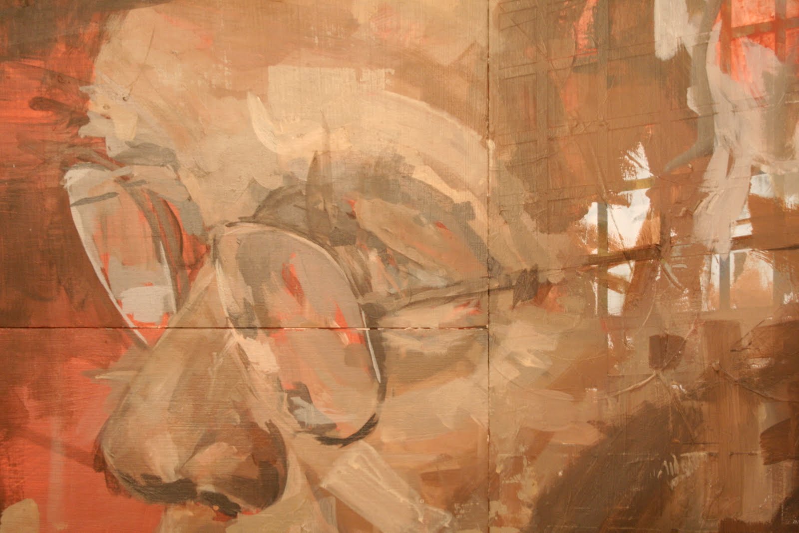
A page or two later from a slightly different angle.
This one breaks the drawing with text, and includes an arrow. . . 
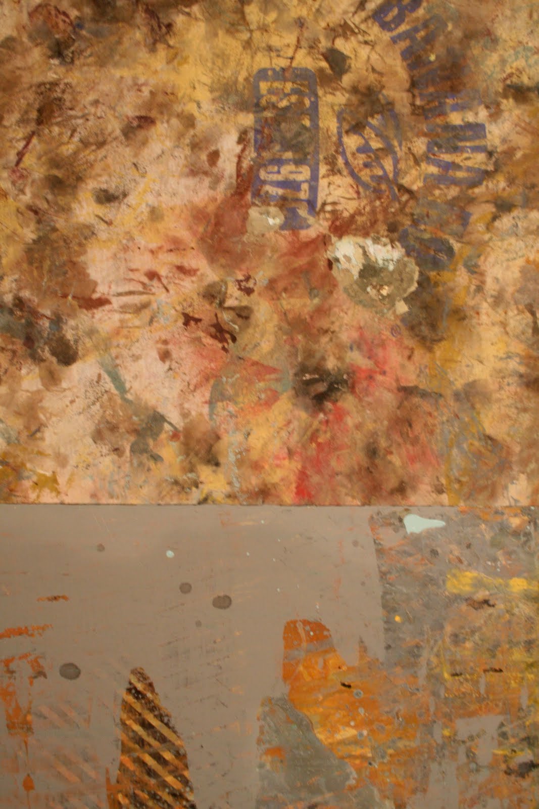
And finally, this spread with its heavy texture creates an interesting relationship and contrast between the delicate drawing and the aggressive texture. The color treatment seems to work nicely and the drawing is engaging enough to hold my interest at this point.

Friday, March 11, 2011

Green Studio Lamp

Beginning a new painting of a green glass lamp that I've had since collage. This underpainting was executed with burnt sienna mixed with acrylic flow release which noticeably lengthens the drying time and increases the paint's staining ability. 


Second day, still using the flow release, but this time burn umber was used instead.

The next night some green was added to the image, the flow release provided more of a glazing application which was nice to establish some subtle color.

This is where it sits now, back to painting opaque acrylic. The trick I think will be to keep some of the thin painting evident while building up the remainder of the painting.

In retrospect I wish the painting had stopped after the second night when it was rendered entirely with burnt sienna and umber. I think that drawn, underpainting color balance would have worked nicely when combined with other more color laden panels. Something I plan to keep in mind moving forward. 

Off for a week to Florida, I'll be back in the studio on the 19.

Friday, March 4, 2011

Work from 3/2 — 3/4

Further exploration of panels combining with the large portrait. The flowers were something I had worked on this past summer. They had been almost forgotten until I found this panel at the back of one of the stacks. Kind of a nice surprise when I paired it up with the other panels to it's right. It was exciting to have forgotten about something due to the volume of work in the studio. That will be important to the work. Doing, forgetting, rediscovering, incorporating. This piece may be done.
Proportions: 72"x48"

The bottom panel had been for a long time paired with the large portrait in the top image. Maybe it works better this way. I think that the simplicity of this configuration helps the viewer to really look at the sleeping portrait which had been a huge compositional challenge when it was paired with the large stripped portrait above. I am thinking now that the top panel may look better on the bottom as well rotating it 180 degrees to allow for the linear elements to work off the figurative a little better.
Proportions: 48"x48"

Worked fast and used a lot of matte medium with the paint when roughing in the baby's head. 

The medium really helped give the acrylic some body and I liked how it loosened me up with the application. Not that this was the first time using matte medium in this way, but it had been awhile and I had fun rediscovering what it could do.


Thursday, March 3, 2011

pattern piece

So, this is where the pattern piece ends. I am going to throw one more layer of clear on it to get the entire surface a consistent sheen. The word comes from a sketch done during the faculty forum last week. It is very different from the sketch, but the idea of  "speak" as a command and statement has some meaning . . . it becomes decorative and loses some of that meaning or communication which is an interesting contradiction. 
Here is a detail to show the layering and build up that has taken place. This piece is approaching the work flow / method of working in the sketchbook . . . so in that regard I think it has been a good exploration. How does that translate into the books? I'm not sure yet, but we'll see. 
Here's Ethan's painting from Tuesday night. He managed to escape without getting paint on himself, but I got splattered with pink from about two feet away . . . 

Tuesday, March 1, 2011

Considering Alternate Panel Formats

For some time now I have been considering if I should depart from the strict confinement of the 2x2 and 2x4 wood panels and begin to work in different supports and sizes. Above is a sketch of sorts pulled from a few things around the studio.

The cloth in the upper right corner is a scrap from the arm rest of the couch I had in college. 

 A lot of old t-shirts are used as rags in my studio and gather random paint marks. I decided to stretch one last night to see how it looked when combined with the wood panels. I like the original graphic still showing through.

Detail of the wood and cloth juncture.

Stripes on Shirt


It had been a few weeks since I last worked on this image, began working on pushing values in the face further as well as roughing in the stripes on the shirt.

One Panel, May 2010 through Feb 2011 — Continued


Continued to work on this with the top panel for a day and then separated the two to see how the single panel felt when alone.

Working with the addition of some cerulean blue for shadow tones really seemed to help balance out some color.